Tips for Designing a Professional Invoice Template in Excel
Looking to give your invoices a professional edge? You’re in the right spot! At Saldo Invoice, we know that a well-crafted invoice isn’t just about requesting payment; it represents your brand. The good news is that you don’t have to be an expert in design to make an impressive one in Excel. We’ve got some simple tips here to help your documents shine.

Introduction to Designing Professional Invoice Templates in Excel
A top-notch invoice does more than list numbers; it helps you stand out from the crowd. When your documents look good, it shows clients that you care about the details. A little care here can really change how people see your organization.
Why use Excel for your invoices? It’s not just for number-crunching! Microsoft Excel offers some fantastic features for designing invoices that reflect your brand. Here’s why it’s a top choice:
- You can use it even if you’re not great with computers.
- You can personalize it with different fonts, colors, and styles.
- It’s integrated with other Microsoft tools, making your work seamless.
- It does the math for you, so you can spend time on what’s really important.
Ready to begin? Check out what we offer at
Saldo Invoice, and let us help you create invoices that truly resonate with your brand. Our tools and templates are designed to make the process simple, yet effective, so you can focus on your business, not just the numbers. Plus, with our friendly support team at your side, you’ll have all the guidance you need to craft invoices that not only look professional but also reflect the values and uniqueness of your brand.

Essential Elements of a Professional Invoice Template
Crafting a professional invoice template is like piecing a puzzle together. You need the right parts in the right places, and everything must look just right. It’s about mixing good looks with practical use, making sure every part does what it should. The colors, fonts, and layout must not only look appealing but also effortlessly guide the reader through the content. Understanding your brand and how to express it through your invoice is crucial.

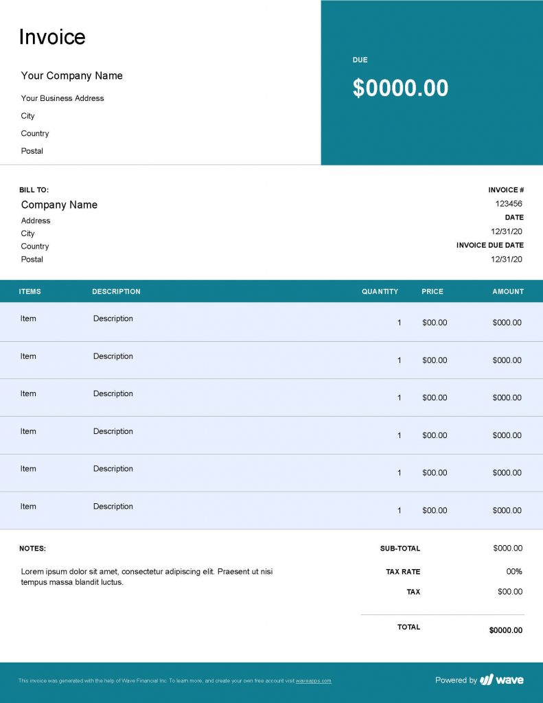
Structuring and Formatting
First, let’s talk about getting organized. Structuring and formatting your invoice is all about making it easy to read and visually appealing. When you’re paying attention to the placement of each element, you are not simply making the information more accessible but also creating a visual story that will resonate with your brand’s identity. Here’s what you need to focus on:
- Organizing information effectively: Think of this as setting the table for dinner. Everything needs to be in its proper place.
- Choosing appropriate fonts and colors: Your invoice should be a visual treat, not a carnival. Pick fonts and colors that match your brand.
- Incorporating branding elements: Your logo, tagline, or other brand features should be there, reminding your client who’s awesome.
Want to see what a well-structured and formatted invoice looks like in Excel? Check out our specific Excel invoice designing templates
here.

Clear and Concise Invoice Content
Once you have the structure down, it’s time to fill in the details. That’s where clarity and conciseness come into play. Don’t leave your clients guessing; instead, include everything they need to know, from item descriptions to payment terms. Forget the jargon; keep it simple and straight to the point. Your invoice is more than a bill; it’s a way to talk to your clients.
However, an invoice isn’t only about the basics. It also includes finer details such as terms and conditions. Lay down the rules clearly so that everyone knows what to expect. Whether it’s the payment deadline or any other special condition, it needs to be crystal clear. Don’t forget to add a touch of your business’s personality and professionalism. Your invoice isn’t just paper; it’s a piece of your brand.
Designing an Aesthetically Pleasing Invoice Template
An invoice doesn’t have to be just black-and-white figures on a page. Your invoice can be like artwork that shows off your brand. It’s a special mix of art and common sense, using pictures and designs that fit your brand. Designing a bill that looks good is about selecting colors, graphics, and fonts that are cohesive and appealing. But aesthetics alone aren’t enough; it must also be user-friendly, with a layout that makes information clear and accessible.

Layout and Visual Elements
Your invoice is a reflection of your brand, and getting the layout just right is like dressing for success. Start with creating a balanced and visually appealing layout that guides the reader’s eyes effortlessly. The choice of fonts and colors here is critical; they should be in harmony with your brand.
Next, consider utilizing graphics and images that align with your brand’s aesthetics. A dash of visual flair can make your bill stand out. Also, don’t forget the header and footer; designing a professional header and footer sets the tone for the entire document.
Need some inspiration? See what can be achieved with our
receipt template in Excel, where visual elements come together beautifully.
Designing a User-Friendly Template
An attractive bill is great, but what if it’s confusing to use? That’s why designing a user-friendly template is equally crucial. Make the template easy to navigate by organizing the layout in a logical flow and including intuitive input fields. Here are some must-haves to consider:
- Clear sections for different information, such as items, totals, and contacts.
- Helpful prompts or placeholders to guide data entry.
- Consistent formatting that aligns with your branding.
We work to make paying easy for you and the people you sell to. Try our
invoice maker and see how easy the billing process can be.
Your invoice is more than a list of what’s owed; it shows who you are, your promise of quality, and how you focus on little things. By using the ideas we’ve talked about, like being clear, matching, easy to use, and looking good, you turn a plain paper into something that really speaks for your organization.
Elizabeth Cherepyna
Product Manager, she is analytic of the behavior of users in the application, communicates with them, to better understand what we need to improve, and sets tasks for her team.
Learn more


